ShopDreamUp AI ArtDreamUp

Deviation Actions


Description
This is the deal with Battle Artist...
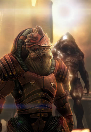
Two artist are matched with a theme... in this case the theme was the Mythological Creature Minotaur.
 created
 created
Looking at these pieces side by side show the contrasting approaches by each artist. The winner of this match was
I also wanted to share that this match was a hardcore pencils match.
If I was an art director and had to pick 1 of these to use for a cover...(that is the scenario I usually go with when I am judging)
I am looking at the visuals, technique, control of media, overall image, success of the artist's message to convey the image to the viewer...
So like I was saying these two artist sent these images to me and I am looking at them as is... not thinking how things could look, but what I have in front of me...
First of the strengths of rock the arts is his handling of the medium of pencils, he's a natural, good work within the minotaur muscle work overall image is great...he created a high tension scene and it has the potential to be killer...
The flaws come here, bad scan first of all...takes away from a great piece...looking closer at the image and seeing what he can do...the piece is not consistently good. The image is top heavy good") meaning that is where all the goodness is. Theseus doesn't seem to treated with such care as the minotaur. I know the rest of the bottom is supposed to be black, but make it so, spend the extra time in created a finished looking piece as in shading in an even black for the bottom for the shades and shadows.
meaning that is where all the goodness is. Theseus doesn't seem to treated with such care as the minotaur. I know the rest of the bottom is supposed to be black, but make it so, spend the extra time in created a finished looking piece as in shading in an even black for the bottom for the shades and shadows.
Moving on to ninja's piece... he tackled the theme head on. Central figure of the image, and he designed his well. There is no question about what I am looking at, everything is rendered and the whole image feels complete.
Flaws...yes its a static image with some elements that can be tweaked but it is what it is.
If both of these came across my desk and I had to choose 1 as they currently look I would have to go with only because it feels more finished and consistent throughout.
But let me say this... has some of the best raw talent with the pencils within the group. Once he learns how to channel it to achieve his true potential he will be dangerous. This round goes to slippy, it shouldn't have but Rocky gave it to him.
Again this is just my opinion as with all forms of art its subjective...
Two artist are matched with a theme... in this case the theme was the Mythological Creature Minotaur.
created created Looking at these pieces side by side show the contrasting approaches by each artist. The winner of this match was
I also wanted to share that this match was a hardcore pencils match.
If I was an art director and had to pick 1 of these to use for a cover...(that is the scenario I usually go with when I am judging)
I am looking at the visuals, technique, control of media, overall image, success of the artist's message to convey the image to the viewer...
So like I was saying these two artist sent these images to me and I am looking at them as is... not thinking how things could look, but what I have in front of me...
First of the strengths of rock the arts is his handling of the medium of pencils, he's a natural, good work within the minotaur muscle work overall image is great...he created a high tension scene and it has the potential to be killer...
The flaws come here, bad scan first of all...takes away from a great piece...looking closer at the image and seeing what he can do...the piece is not consistently good. The image is top heavy good
Moving on to ninja's piece... he tackled the theme head on. Central figure of the image, and he designed his well. There is no question about what I am looking at, everything is rendered and the whole image feels complete.
Flaws...yes its a static image with some elements that can be tweaked but it is what it is.
If both of these came across my desk and I had to choose 1 as they currently look I would have to go with
only because it feels more finished and consistent throughout. But let me say this...
has some of the best raw talent with the pencils within the group. Once he learns how to channel it to achieve his true potential he will be dangerous. This round goes to slippy, it shouldn't have but Rocky gave it to him. Again this is just my opinion as with all forms of art its subjective...
Image size
1440x997px 1.39 MB
© 2012 - 2024 dreno360
Comments4
Join the community to add your comment. Already a deviant? Log In
damn the scan lines. i was really tempted to just put X's on the black parts like all comic artist do. i see i made a mistake but i can respect this. the scan will never happen again!